
Having studied color psychology at Pantone and being at the head of Agence Couleur Kryptonie, Marie – Chantal shares her vision of neutral colors with fabulous trend colors.
The 5 favorites of Marie-Chantal
When talking about neutral colors, most people tend to think of gray, beige and brown. Yet the two largest neutrals are in nature: green and blue! The vegetation, the sky, the oceans… But of course!
But what is a neutral? By definition, a neutral is a color that can easily highlight other colors that accompany it, without stealing the spotlight.
Here are 5 “new neutrals” that will be particularly trendy interior paint color in 2025, and that will inspire you to change the gray!
- French Vanilla
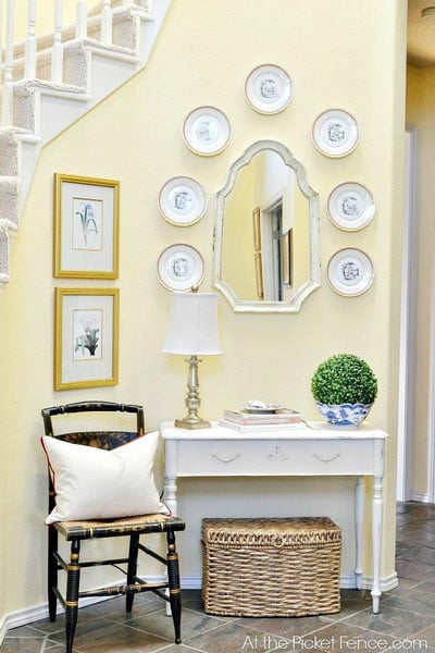

atthepicketfence.com
French Vanilla is a cream with a touch of yellow. This subtle presence of yellow has the power to illuminate a room by adding a sense of sun.
It is the color par excellence to enlarge a room devoid of windows, like a small bathroom, or even to intensify the light effect of a room already very bright.
Being one of the first colors that babies see, it is also a perfect shade for newborn rooms. And because creams are often associated with food, they are also great options for kitchens and dining rooms.
potterybarn.com
- Hazelnut

lisvivarte.com
Being in an economically and politically unstable period, the brown has the power to root us and secure us.
The sweetness of Noisette soothes us compared to dark brown, in addition to enlarge the room and infuse a very natural atmosphere.
Wood color, Hazelnut is the perfect neutral for a room where vegetation reigns. In short, it is a beautiful shade to relax!
- Ballerina
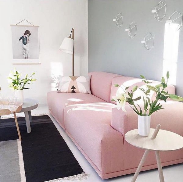

altoastral.com
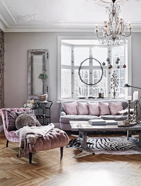
Interior designers and millennials are crazy about pink now! Used in some prisons to calm prisoners, the rose exerts incredible power over our subconscious.
Besides, it is far from being an exclusively feminine color; at the time, pink was the color of baby boys and blue was the color of little girls. Today, the rose is the very symbol of the neutralization of colors and their dissociation to a specific genre.
Finally, the rose has the capacity to make more happy; because let’s be honest, we all need to see life a little pink!
- Aqua Mint

countryliving.com
Aqua Mint is a color with super powers because it can help anxious people to relax. Indeed, this color has a positive and relaxing impact on people who have difficulty to calm down. It is not a coincidence that it is complementary color (opposite) to red!
Aqua Mint can even go as far as lowering your blood pressure. It is a tinge of connection to the inner self, vitality, enthusiasm and change.
If stress is too important in your life, now is the time to integrate Aqua Menthe into your environment!
- Monaco
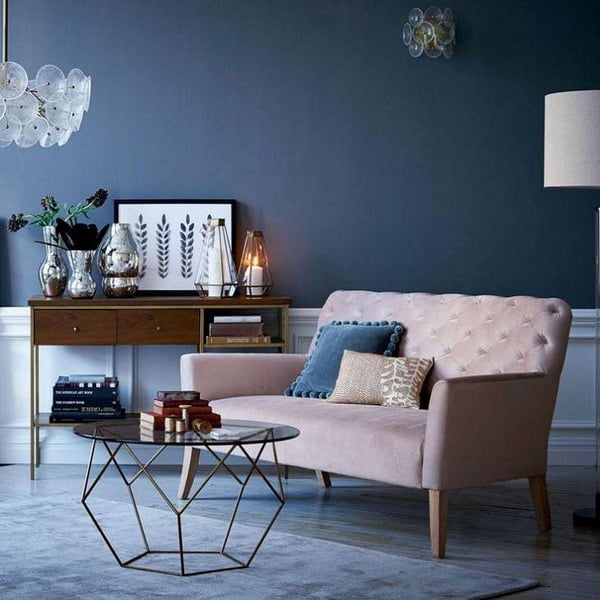

sainsburys.co.uk
Do you have trouble believing that a dark blue like Monaco can be a neutral? Think about denim and how a pair of jeans can match almost anything!
Monaco is a color that can optimize concentration, encourage deep meditation and even improve sleep.
It’s up to you to decide whether it’s better to use your powers in the living room, the office or the bedroom!
The 5 favorites of Andréanne
In 2025, we leave aside the glam to get closer to nature and sobriety, as much for materials as for colors. Pantone proved it last year by introducing Greenery, a soft green that perfectly represents the pinnacle of green nature.
However, we will integrate this sobriety with neutral colors. So, apart from white and gray mice, what will be the other neutral colors to use next year? In addition to the fabulous selections of Marie-Chantal, I complete by presenting my 5 predictions color trends 2025 !
- Clay
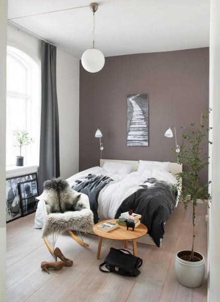

cotemaison.fr
I could have named this color “Taupe”, but Clay brings us back to the organic, the earth!
Bring nature inside with a slightly purplish brown. It is an easy color to match with shades of pink and blush, which are currently throbbing our hearts!
Clay is a perfect color for pampering in the bedroom!
- Earthy Orange
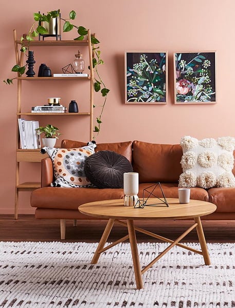

adoremagazine.com
Orange is the most welcoming color of all; it is at the heart of the range of friendly and soft colors.
Most of us are drawn to the orange-colored spaces, because we feel more sociable. Thus, the living room and the dining room are the perfect places to paint this earthy color.
As it refers to ethnic cultures, Orange Terreuse will be perfect with colorful patterns, tan leathers and natural wood.
- Green of gray
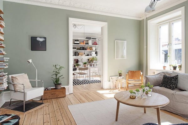

shakemyblog.fr
All green derivatives will still have their place in 2025. As Marie-Chantal says, mint green, khaki, bottle green and neutral green (which I call Vert de Gris ) will be in the wind. This green imbued with bluish gray is timeless and so refreshing!
In the bathroom, this shade will provide an impression of summer relaxation throughout the year and in other rooms, it will evoke the good weather and freshness.
- Neither Lilac nor Gray

decosurfaces.com
This color is amazing, is not it? It is already part of the current trends in Europe and the United States, since these places are always one to two years ahead of us. So why not introduce it!
The purplish colors are called magical because they are eccentric and give a fantastic and playful aspect to the room. Thus, they must be used with tact so that they are pleasant on a daily basis.
Use with architectural accents, accessories or silky textiles. If you decide to paint walls with this color, it will be an incredible ally to make imperfections disappear. Convenient!
- Roller

planete-deco.fr
We can easily project ourselves into a place that takes on this soft and simplistic hue. Pebble, a warm gray, is ideal for those who do not like bright colors. This hue is, however, the ideal backdrop for putting other more sustained colors in the foreground.
Galet can replace the white by warming the room, while maintaining a sublime minimalism!


