The color in decoration is a fundamental tool. The study of color is a fascinating and very vast subject, here we only intend to give you a mere introduction. We will show you below a lot of perfect color combinations to achieve a beautiful decoration.
When choosing colors in terms of decoration, what counts is personal taste, and the rules and color schemes should not always be respected to the letter. But surely there are some basic principles that will simplify the task.
Harmonic colors
We will start with the harmonic colors and within them by the monochromatic schemes, that is to say when we combine a color with its different tones. Monochromatic colors are saturation variations of the same color, which are obtained by moving from a pure color to the center of the chromatic circle.
Analog colors
We will see another way to achieve harmonic combinations of colors. In the previous paragraph we talked about monochromatic colors, now it is the turn of the analogous colors , they are the ones that are next to each other in the chromatic circle and share the hue. When we talk about nuances we mean a pure color and its adjacent colors in the chromatic circle. Thus we have that yellowish green and teal are different shades of green.
The use of this type of palette assures us a harmonious and unifying effect, but we can run the risk of obtaining a somewhat boring space, if we do not add a touch of a contrasting color.
Complementary colors that contrast
In principle, two large groups of colors could be distinguished, those that harmonize with each other and those that are contrasting. The contrasting color schemes are those that are based on the use of colors that are opposite in the color circle. For example, red is the opposite of green, yellow is the opposite of violet or blue is the opposite of orange.
When two complementary colors are arranged next to each other they produce a vibrant, exciting sensation that attracts attention. Sometimes they are used dimmed with white, in their pastel tones giving a more delicate effect.
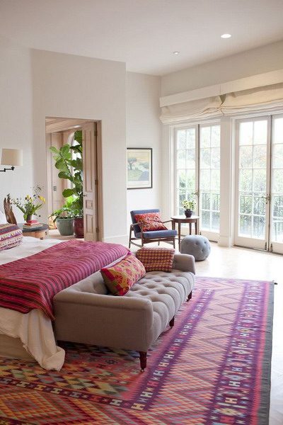
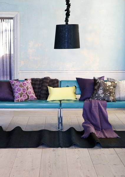
Violet and blue
Different shades of blue from turquoise to navy blue, go very well with the violet, the purple, to the wine erase. An excellent color combination that goes well in all decorating styles.
We generally associate these colors with the rooms for teenagers, but here we show you how they are tones that adapt very well to different scenarios. Violet in all its wide range of shades ranging from lilac to almost eggplant color, is a color that goes well both in elegant and refined spaces as well as in more uncontrolled environments, as we see in the following image that corresponds rather to A hippie chic style.
If we want to obtain a sober decoration, we will use less strident on a neutral background, with white or gray. And if we want to brighten up this combination of cold colors a little, we can add a fuchsia touch here and there, inserting a cushion, or placing a vase of fresh flowers.
Red, white and turquoise blue
Beautiful combination of colors. The turquoise color is perfect for those vintage furniture. The red color makes a strong contrast and gives life and character to the environment.
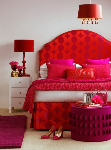
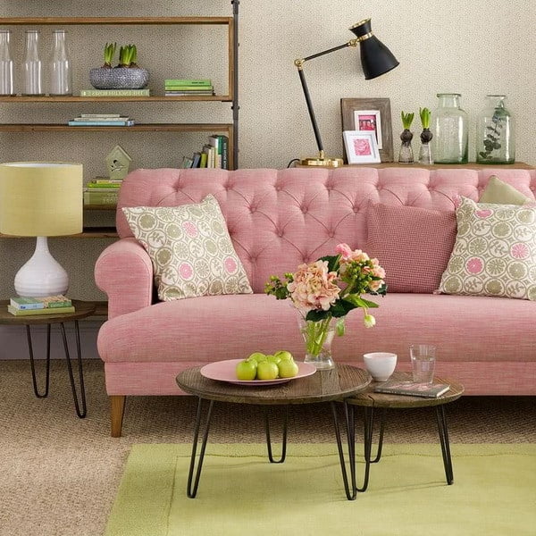
Pink and red
Pink and red, a beautiful combination.
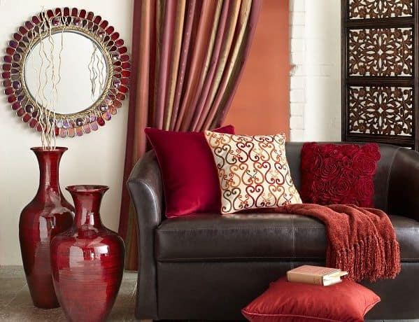
Red, orange and brown
Reds, oranges and browns, these are the colors that are associated with autumn, the possibilities of combinations of these colors in their different shades are endless as nature shows us. They are widely used in interior decoration, as they make the environments look comforting and welcoming.
They are classified into warm colors. Red and orange are stimulating colors, cheerful, evoke the heat of fire and passion. The browns instead are associated with earth, wood, stones. Due to their dense and firm nature, they are considered a serious, honest, simple, friendly color.
Brown has the virtue of combining well with the rest of the colors, both in its darkest and lightest versions such as beige or cream. In its light tones it is the ideal color as background, where we can highlight the decorative details that will shine with a shine and a richness that will surprise us. A wide variety of accessories can be found in this range of colors: ceramics, textiles, wood ornaments or upholstery fabrics for furniture or curtains.
Yellow and white
The yellow color can be used in any room transmitting warmth and joy. Whether in its clearest versions, either through the yellowish light provided by incandescent lamps, it floods the spaces creating especially welcoming environments.
When yellow is used next to white, its luminosity is further accentuated. It is a primary color and is also classified within warm colors, supports multiple shades and all combine perfectly well with the white color.
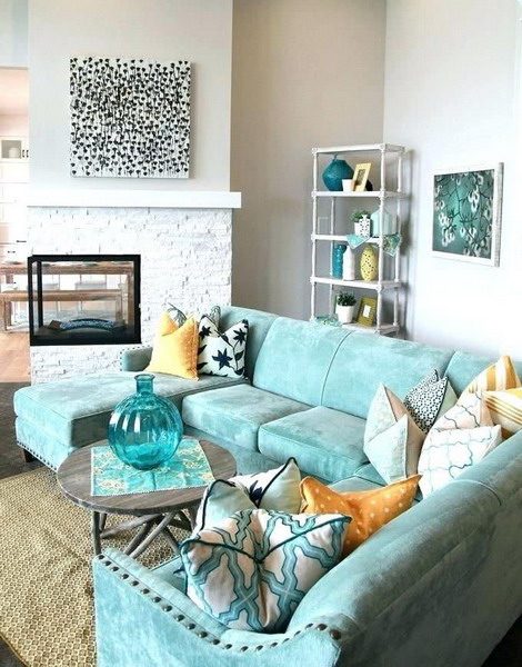
Turquoise and neutral
It is the color of the ocean in the Caribbean, which transports us to a haven of peace and tranquility, with its beautiful shades between blue and green.
The turquoise color is an extremely versatile color and is easily combined with both dark and light colors. It is the ideal color to refresh a conservative environment or to illuminate rooms decorated in neutral, gray, white or black colors.
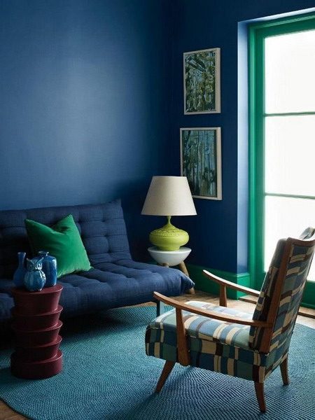
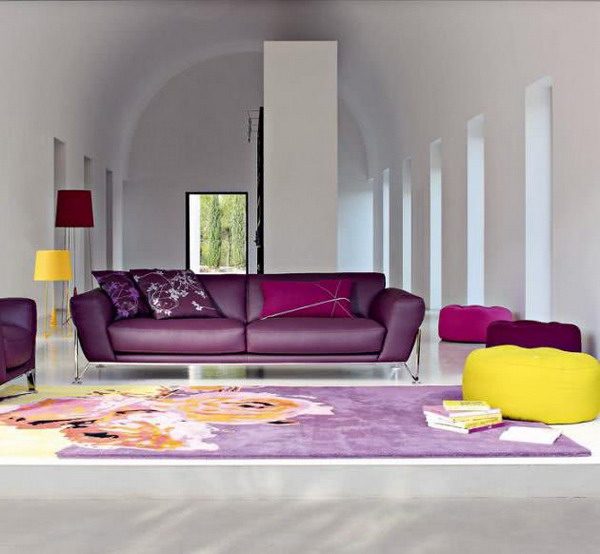
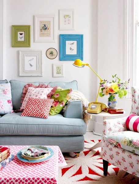
Pink and green
Pink and green are complementary colors, that is to say opposites in the chromatic circle, that is to say that together they are contrasting colors producing a vibrant and vital and at the same time harmonious sensation.
The lime green color of the walls enhances the different pink tones of the cushions as well as the rest of the accessories. To balance the whole the white color of the furniture and the floor is essential.
This other room also uses the same combination of pink and green colors but dimmed with white in its composition achieving these beautiful pastel tones. In general, pastel colors combine well with each other, which is why yellow tones or creams also work very well in this type of color scheme. As in the cushions with flowers and the mat that matches. And of course white or natural wood never fails to harmonize all the elements of a space.
Gray with striking colors
The gray color is a neutral tone, well combined can be very elegant. The range of tones is very wide from pearl gray to lead gray and adapts to different styles. Designers love gray because there is always a hue or shadow that works with any color.
It can also work as an antidote, for example, if you have chosen an armchair in a color that is too extravagant you can dim it with accessories in gray that will soften it. Therefore it also serves as a sophisticated backdrop for bright colors. It is a bit serious color for family rooms or children’s rooms, so in those cases it is better to avoid it.
The warm tones next to the gray ones create a relaxed and cozy atmosphere. The perfect combination of gray is with pink, in all its versions, also with yellow, light blue or light green.
White with vibrant colors
When you face an empty space painted white, it’s like when the artist stands before a blank canvas, pure and fresh, ready to welcome your inspiration and creativity.
A noble space that will admit to being colored and modified by means of the objects that you place in it, with which you will “dress” the room, with touches of color.
You can afford to use bold, bright, contrasting or harmonic colors, everything is possible on a neutral basis. And the best part is that you will have the possibility to change it radically by removing or adding objects of different colors and textures.
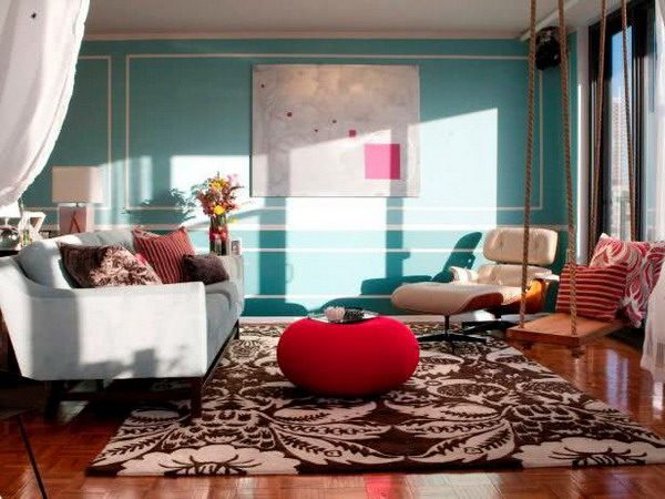
This modern room is a typical example of how to decorate using opposite colors in the color circle such as green and red. A vibrant, dynamic and cheerful effect is achieved.
The combination of colors so striking, very seen in rooms of girls and adolescents in this classic interior take on another dimension, giving life and joy to a traditional room. The mixture of styles, the way of combining the old with the modern and the ability to play with the colors make this house an excellent reference where to find inspiration.
A good combination of warm colors on a neutral background always results in very cozy and cheerful environments. But a high impact effect is also achieved by combining opposite or complementary colors such as shades of reds and oranges on different shades of green.
Color and more color, upholstery, furniture, lamps, wallpaper and rugs with different designs of prints, in unthinkable combinations. Ideal for vintage or hippie chic environments, in a profuse mix of pieces and styles that looks really fabulous.
Author and editor. I write about Interior designs, Beauty tips, IT services for business, Real estate and foreign trade. Strongly passionate about games, comics, art, literature, design, fashion and decoration, I will tell you in detail the best stories in the world of beauty and will guide you through the most popular trends of the moment.