To use color as an effective weapon in design and decoration, it is essential to take into account some basic principles: how to make the most of its possibilities, its psychological effects and how to combine them. Next we will give you a few interior color ideas.
What color to paint the walls? There are many ways to use color in decoration and it depends totally on the personal preferences of each one. There are no strict rules when choosing how to paint walls, but here are some examples of the most popular ways of using color in interior decoration 2021.
Combine neutral colors
No doubt the predominant hue of a room will determine its character. We must take into account the activity that will be developed in each space. For example if we want to create a playroom for children, we will need bright and cheerful colors, but for a bedroom we will look for relaxing tones.
Beige
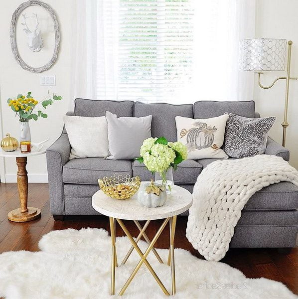
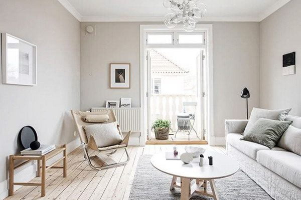
If you do not want to risk too much you can choose to combine neutral colors such as different shades of white, gray or beige. Both gray and white admit infinite nuances. Ideal if you want to create a serene, calm and elegant environment, which does not imply that it is boring.
The most traditional style is to use a color for the walls and use another color, usually white, for the ceiling and openings (windows and doors). It is a formula that never fails, neat, but that gives a somewhat rigid appearance in some cases.
Whites
To soften the contrast, you can choose a shade of white that resembles the color of the walls, which will make the visual change more gradual and we are not so aware of where things start and end, the boundaries of the room tend to disappear and this makes the room feel bigger. Generally, neutral or complementary shades are suggested in the paint color lists for each of the paint colors chosen.
How to avoid boredom? Varying the intensities of tones and texture in space. A touch of color here and there will give life and focal points of interest.
All these houses are characterized by having used the color in a very intelligent way: they only use the color in the accessories, the curtains, the rugs or the bedding, never in the walls, or the furniture, which will greatly simplify the task when it comes time to innovate the decoration of the environments.
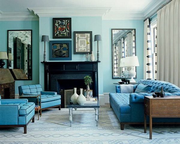
Monochromatic color scheme
It is when a single color and several of its nuances are used in slightly lighter or darker tones. The palettes that are in fashion are mainly blue, teal and orange.
Oranges
To give some relief to the eye it is ideal to combine it with a neutral color. The ideal is white, but it can be black or even its complementary, which used in small quantities, whether for accessories, door and window frames or furniture, will serve to balance the monochrome scheme.
Blues
You can think that using a single color to paint a room can be boring but in fact it can give very sophisticated environments, especially if you make good use of lighting, illuminating several points with different intensities.
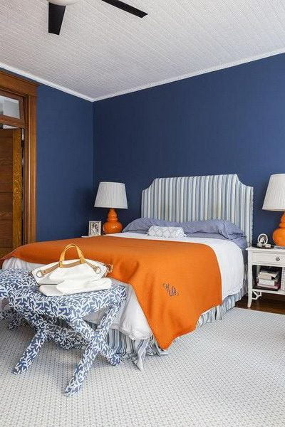
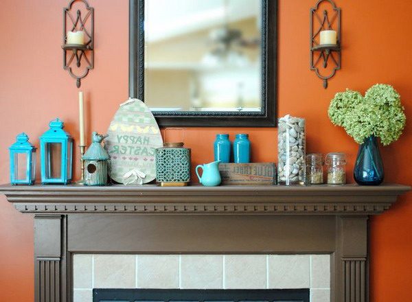
Contrasting colors
Blue and orange
Opting for intense colors can be a somewhat risky option when looking for what to combine it with. If you paint a wall with a strong color you must balance it with another strong color.
In that case, it is safest to use its complementary color, that is, its exact opposite in the color circle. Such as red with green, yellow with violet, blue with orange and its intermediate tones.
However, it is important that highly saturated colors are well managed so as not to create a discordant appearance. To prevent this from happening, I think it is better to work colors of lower saturation, for example, the image below has a blue on the wall and complements it with the orange color of the accessories. The interior designer of this room has created a well-balanced complementary color scheme that is not overwhelming.
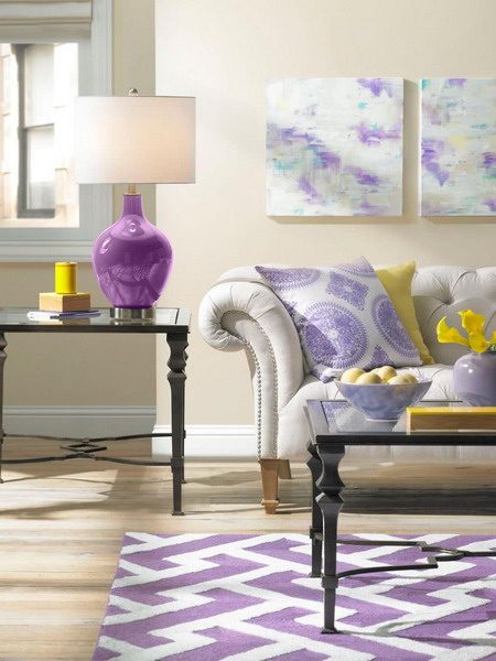
Lilac and yellow
In general, vibrant and bright colors are energizing and cheerful, ideal for youthful and bright rooms. But be careful because if we don’t find the right combination it can be overwhelming and disturbing.
Trend colors for striking interiors
Yellow
The fastest and simplest way to brighten up any environment is by introducing touches of color. Injects vitality and energy into spaces through vibrant and daring colors.
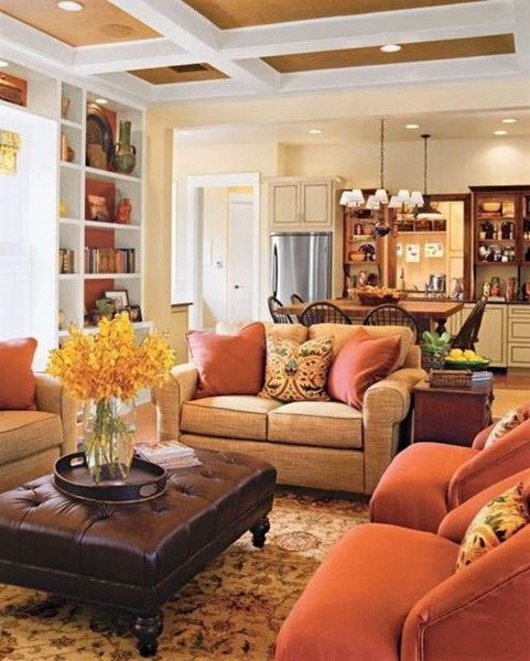
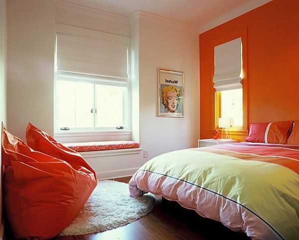
Orange
But be careful, an intense tone should be well used, it is not necessary to abuse, sometimes painting a wall is enough, as is the case in this bedroom where a single orange wall has been painted, which has served as a starting point to create the whole color scheme.
Turquoise
The combination of qualities between the serenity of the blue and the toning of the green that make up the turquoise, inspires relaxing thoughts, evokes tropical water paradises providing an effective escape to the daily problems of the world, while at the same time, restores our sense of well-being . In many cultures it is considered a talisman that grants protection to ward off evil spirits and is capable of healing.
Either because it evokes a calm ocean or a precious stone, turquoise is a color to which most people respond positively. It is attractive to both men and women, and is easily incorporated into fashion and interior design. With both warm or cold nuances, turquoise goes very well with any other color of the spectrum.
Turquoise adds a touch of excitement to neutral and brown colors, it is the complementary color of reds and pinks, creates a classic maritime look when combined with deep blues, animates all greens and especially yellow-green ones.
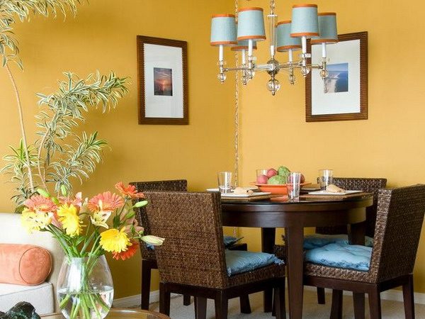
Blue and yellow
Colors for daytime environments
Mineral Gray or Cinnamon
The choice of color depends a lot on the type of environment to be painted and what is the purpose that is sought.
For example, in a dining kitchen where the family has breakfast, the ideal is warm and functional colors, consisting of a palette of fresh, clean and cozy colors. Honey tones, such as cinnamon or light gold, are recommended. Also yellow, coral or mineral gray.
Colors for night environments
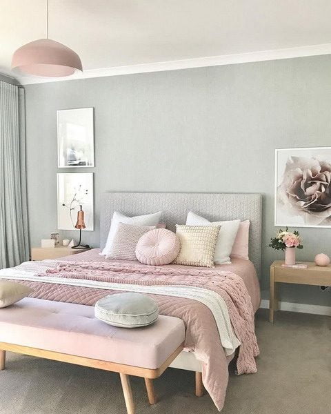
Pastel shades
The recommended colors are pastel colors, especially blue or pale pink and on the dark blue roof, eggplant or red wine. Especially suitable for bedrooms and bathrooms.
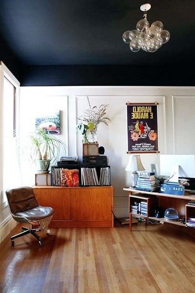
Colored ceilings
Inspiration for the night palette can be applied on the ceiling. Why sleep under an opaque white canopy? Why not paint the ceiling in the same color as the walls but in a darker shade?
Before and after examples
Every year an investigation is made in the paint industry and what color trends will be published for the next season. Color trends indicate that the personalization of the space where one resides continues to act as a motor when choosing colors. Either accenting the color on a wall or in small areas, to give a high impact dose and use more subtle colors on large surfaces, to achieve unique and original environments.
The best sources of inspiration to achieve a composition of colors in decoration are: art and nature. Look closely at a landscape or a painting that pleases you and seems chromatically balanced and imitate it in your design. Analyze the amount of color, how the different shades are distributed and related to each other and then try to reproduce the same proportions by combining the color of the wall, with the carpet, furniture and accessories.
On the other hand we should not take the rules of color schemes and ways to combine them categorically, what ultimately counts is the personal taste of each.
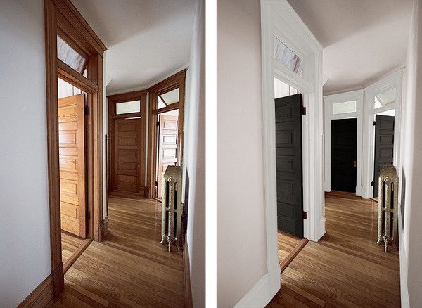
This is another example of a before and after where color makes a difference. The entrance looked quite monotonous, so it was decided to paint a wall in two colors, dark gray, which is very well next to white.
Without investing in major transformations, because it is a rented apartment, simply with a few details and good taste, where color plays a fundamental role, an environment can be changed substantially, without the need to remodel.
Author and editor. I write about Interior designs, Beauty tips, IT services for business, Real estate and foreign trade. Strongly passionate about games, comics, art, literature, design, fashion and decoration, I will tell you in detail the best stories in the world of beauty and will guide you through the most popular trends of the moment.