Do you have questions about interior and exterior painting of your home? Read the article and be aware of the trendy colors in interior design in 2024. Also, take the opportunity to learn about the meanings of tones that are in high demand.
Coral, one of the major paint brands in Brazil, has chosen Winter Square as its 2024 color of the year. Inspired by the morning sky, this shade is in harmony with the future as well as the connection we make with family, friends and nature.
According to Coral, “Square in Winter” is a versatile and soothing color. It gives incredible palettes and can be used in different rooms of the house, including the living room, bedroom and kitchen.
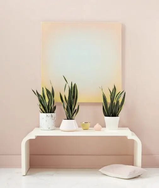
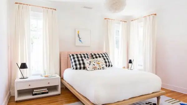
Eucatex, another paint brand, has chosen “Modernismo” as its 2024 color of the year. It is a light pink shade that reflects feelings such as love, affection, sweetness, tenderness and prosperity. It is the best choice for repairing the walls of the house and improving well-being in times of crisis.
Other shades of light pink are also on the rise and make the interior design more delicate.
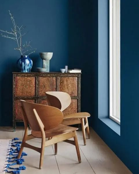
Classic blue
Pantone, the global color standard, has named Classic Blue 19-4052 one of the biggest sensations of 2024. This shade indicates clarity and communication, and is also reminiscent of the sky at dusk.
The classic shade of blue is timeless, simple, calm and has a high level of stability. It signals protection, calmness and confidence, but also carries the inspiration of nature, especially from the bottom of the sea.
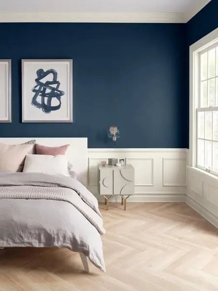
Dark blue
However, in the group of shades of blue, Sherwin-Williams chose “nautical” ink as the color of the year. It is a calm and versatile dark blue color, reminiscent of the night sky or even the depths of the sea.
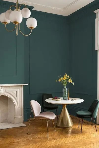
Dark green
Shades of dark green have been very successful abroad and have now arrived in full force in Brazil. They are ideal for embodying balance, security and tranquility. Not to mention, darker shades represent the healing power of nature.
Dark green is a delightful, therapeutic and sophisticated color. The tone, which stands out as the trend of the season, is ideal for all interiors and can also be used to paint facades.
It is important to be careful when applying this color in small spaces, as there is a risk of making it too dark.
Cream, beige and white
There is a minimalist vibe in the air, which is why many people opt for palettes that value cream tones. In this case, the walls are painted in beige, white, cream and other light neutral tones. This timeless simplicity goes with all types of lighting, furniture and decorative items.
Shades of gray
Grey, a particularly light shade, is on the rise. Since it is a neutral color and easy to match, it can be used in home cladding as the “new white”.
Earth tones
Nature was a strong inspiration for the color palette. In addition to green, residents can also bet on earthy tones, which represent the earth and the search for roots. Light brown, mustard, and burnt orange are some options.
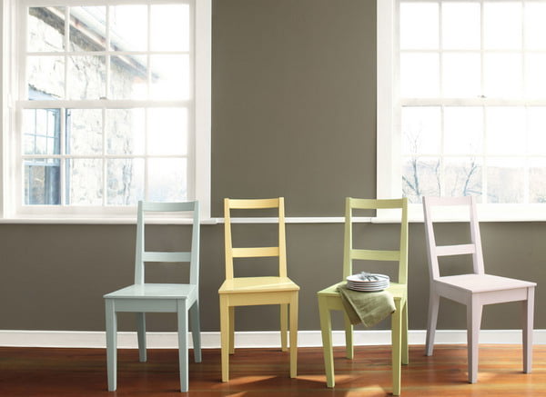
Pastel shades
Pastel colors are ideal for interior decoration in a minimalist style. They are soft, elegant and add charm to any room in the house.
Tips for using colors in decoration and facade
Here are some interesting ways to use colors and recommendations:
Consider painting the ceiling
If you want to use one of the colors in your decor, consider painting the fifth wall. A ceiling of a different color can be visually interesting in a room layout. In some spaces, even the use of graphic patterns, such as stripes, is possible.
Sections
An interesting tip to make the space look bigger is to create sections in the wall art. Use two colors in the composition, achieving contrast at the top. This strategy is super hot and can push the ceiling higher.
There are other techniques that combine two or more colors on the same wall, such as ombre on the wall. The result is a gradient composition that is ultra-modern, sophisticated and bold. So keep this trend in mind when painting your home.
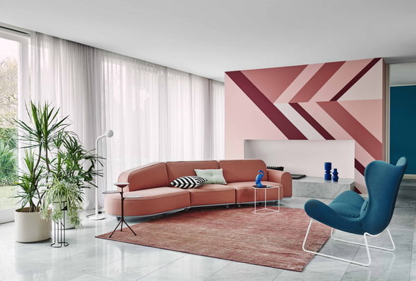
Geometric painting
The geometric painting technique is a decorating trend that is in line with contemporary homes. It can be put into practice in the living room, bedroom, kitchen or any other environment, enhancing shapes such as triangles and circles.
Style score
The chosen color should emphasize the architectural style. Neutrals and light tones, for example, work well with modern designs. These soft colors can be explored not only through painting, but also through stones such as canjiquinha.
In the case of a rustic-style property, such as a country house, it is worth working with earthy colors on the façade.
Get to know the feel of each color
Each color conveys a feeling and has a special meaning, at least according to feng shui.
White represents infinity and emptiness. Lavender restores a sense of calm. Pink is a synthesis of love and tenderness. Red is a stimulating color, just like orange, which fuels creativity. Yellow has the ability to stimulate the mind to the fullest.
There are also green and blue colors that are directly related to well-being.
Consider Maintenance
When choosing colors for your home, keep in mind that the richest and brightest tones fade faster. The color loses its saturated shade over time, especially when applied to the facade of the house.
5 trending wall colors for 2024
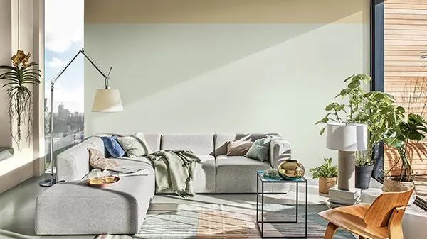
Greyish green
Calm colors are in trend now. These are the right colors for an increasingly hectic pace of life. They have become almost a necessity.
And among the soothing colors, grayish-green is the leader in its properties.
Green, as we have seen, is the most soothing color. A color with which the eye rests, which gives a feeling of calm like no other.
In this way, greyish green combines the soothing properties of the standard green, but is further enhanced by its low saturation and strength, resulting in one of the softest, softest and most soothing tones in the entire color range.
In fact, Bruguer’s color of the year, Tranquil Dawn, is a color that is born in opposition to this increasingly hectic and digital world, and do you know where that color is? Precisely, among the grayish greenery.
It has already become clear that grayish green is one of the trendy colors due to its characteristics and soothing properties. Now I will tell you how to combine it.
Luckily, since it is a shade of grayish green, it pairs well with just about any color. But it pairs especially well with warm tones such as beige, wood or plant fibers, which add a warmth that this color lacks and can create a palette for your home in perfect harmony.
So, if you want a space that is soothing yet warm, cozy and bright at the same time, pair grayish green with wood, plant fibers and a beige tone.
If you want to see other combinations, here you can see 15 colors that go well with green.
Now let’s move on to the next trending color of the year 2024 for walls.
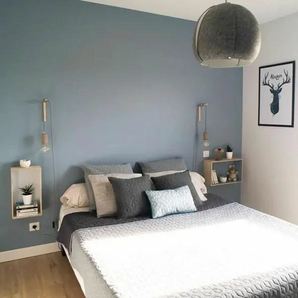
Bluish gray
As we have seen on the blog and I have commented many times, blue and green are the most relaxing colors.
In fact, blue and green have very, very similar characteristics.
Both are in the cold part of the chromatic circle, both are relaxing, and both are part of “natural” colors, as these are the colors we find in nature itself, such as the blue of the sky or water.
With calm and soothing colors winning by a wide margin this year, it’s no surprise that blue-gray is among the most popular.
And as I said, blue, and especially shades of grayish blue, which have little saturation and are soft, almost neutral, along with greens, are the most soothing tones we can find in the chromatic circle.
Another advantage of greyish blue is that it is an elegant and versatile color. It fits very well in any space.
We can paint grayish blue both a nursery and a living room with full success, as well as an office or any other room, as it adapts to all of them.
It is also a color that pairs very well, but some of the shades that it pairs best with are beige and pink.
What color do I recommend if you want to paint your house like this? I recommend two:
The first one is in case you want a soft greyish blue tone and this is Bruguer’s Tranquil Dawn. Remember I told you earlier that Brueger’s Serene Dawn was greyish green? It is also bluish gray. It’s halfway between both.
The second, if you want a more intense bluish gray, is Bruguer’s Denim Gray, which we see right above those lines.
Savasana
This beautiful color belongs to Valentine, who named it a trendy wall color last year. Warm tone and, of course, relaxing.
As you can see, all the trend colors for 2024 are going in this direction: peace, relaxation and well-being.
Unlike the two colors we looked at at the beginning, grayish green and bluish gray, Shavasana Valentina is a color that is in the hot part of the color wheel, so it is a warm color. Warm yes, but also relaxing.
It’s somewhere between off-white and off-white. Tone with a slight saturation, very bright and friendly.
So if you are looking for a color that will brighten up your home by painting the walls as well as creating a feeling of relaxation and cosiness, Shavasana Valentina is the one for you.
It is also worth highlighting the endless combinations of this color, and it is a color that can be very well combined with everything, but especially with shades of wood, plant fibers, earthy greens and reds such as terracotta or tile color.
So, for example, if you want, you can paint one wall of your living room terracotta red and the rest of it this glowing color, creating a modern, warm, light and relaxing palette. This is just one example of how much you can do with this color.
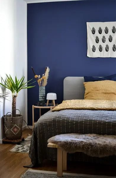
Classic blue
Yes, blue again, but this time the classic blue, recognized by the Pantone Color Institute as the color of the year.
While it’s a stronger and more powerful color than any we’ve seen, Pantone is also based on the same qualities as other colors: relaxation.
Remember I told you that blue is one of the most relaxing colors?
No wonder this color has become so trendy lately.
And that Classic Blue is a timeless color, but also elegant and simple.
“Blue inspires calmness, instills confidence and creates connection, highlighting our desire to strengthen the reliable and stable foundation on which we build our way to the threshold of a new era.” Here’s how Pantone defines it.
A color that brings peace, promotes concentration and reflection, and increases resilience. Is on.
So if you’ve been looking for a trendy wall color that’s brighter than the soft tones we’ve seen, Classic Pantone Blue is for you.
If you want to enhance its qualities, you can combine it with wood tones, plant fibers and accents of browns and beiges to add warmth to the cold color of nature.
In addition, you can also see 14 other colors here that go well with blue.
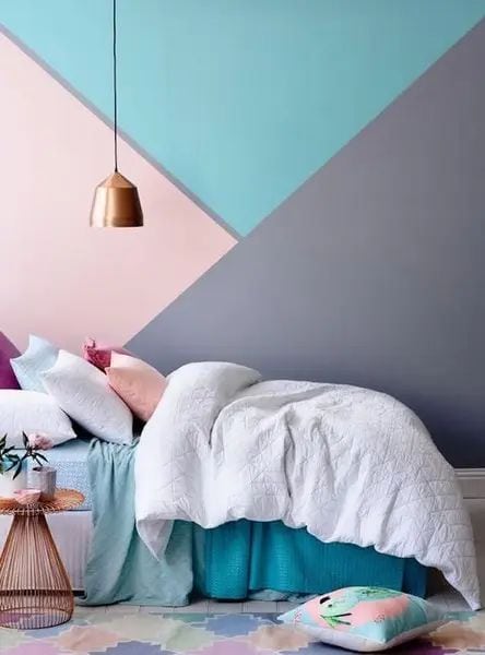
Earthy pinks
Pink was trending years ago, especially Pantone Rose Quartz, and it hasn’t faded since.
What it did is it evolved from a dusty pink or pale pink to a pinkish earth tone.
Earthy pinks are in the hot part of the chromatic circle, so they are warm colors that can easily create a very cozy environment.
In addition, they also stand out for having a very bright color due to their pigmentation.
Another advantage of these colors is that they go very well with wood tones and plant fibers, like the rest of the ones we have seen, which today abound in many homes in the form of baskets, furniture and other accessories of a natural nature.
But not only, as you understand, these tones are also in trend for this reason, and even because they are also relaxing.
In addition, it is very easy to achieve an elegant and sophisticated environment with them. Much easier than with blue or green, for example.
Color trends 2024
Color trends 2024 can help us decide which shades to use. After all, choosing colors for an environment can seem like a complicated task, because there are so many options that we get lost without even knowing where to start.
Broadly speaking, I’ve been seeing 4 types of shades as the big bets of 2024 and 2025: greens, blues, earth tones and lavender, all of which appear in their dirty or dusty versions. Some more, some less.
But in addition to these four shades, we can still expect other color trends 2024, which have already been seen in architecture, art and even fashion shows, which I comment at the end of this article.
Greens
Starting with greens, which several companies have adopted as their colors of the year 2024. We see greens as trends that are closer to the shades that actually exist in nature. They are not artificial greens; they are more natural and invigorating greens.
As they are elegant colors to use indoors, I think these shades of green are a great option to do something different without going overboard. Perfect for those who want to bring a touch of color to their decor but are afraid of making the space too colorful.
My suggestion is to avoid the warmer, livelier greens, and use more faded greens, whether light or dark. Hues like sage, military green, and any grayer shade of green are super popular and are easier colors to wear than warm, saturated greens.
Earthy tones
Earthy tones continue to be pointed out as major color trends 2024, but there is a lot of myth behind this subject. A lot of people think that earth tones are the same as neutral tones… or worse: that earth tones are just brown and beige. There is an incredible variety of earth tones. It’s just that we’ve already associated earthy color with brown. But from light and subtle beiges and sand tones, through yellows and burnt oranges, caramel, terracotta, clay, sepia, chocolate… to pinks and coral tones and greens that tend towards brown are also seen as earthy tones.
That is, if you want, you can create a very rich color composition using only earth tones. And this really has been a super trend in interiors. Most of the environments assembled by the professionals explored earthy palettes – and even so, the environments had the same colors, huh… on the contrary!
But the fact is that earthy colors promise to continue to be used a lot, because they provoke a great feeling of welcome and represent a connection with nature, as I said in this video here, where I mentioned the 10 main decoration trends of 2024.
If you want to set up an environment exploring earthy tones, try to diversify the color palette, to make the environment more inviting and less obvious. Warm earthy colors comfort and soothe, and are perfect for creating cozy environments.
Lavender
A color that has been pointed out since 2019 by trend forecasting experts is the color lavender. And I bet you thought about PANTONE’s Very Peri color now, didn’t you? But there were already much older studies from other trend forecasting companies that pointed to lavender tones for 2022 and 2023.
This is a color that many people find difficult to use in interiors, but which can really be very relevant in the composition of decorated spaces, because it is easy to use this color to convey feelings of tranquility and spirituality, so necessary in today’s times.
Shades of lilac and violet, used without opposing colors, are good options when your goal is to create delicate environments.
Blue
Blue is always a joker color in decoration. After all, who doesn’t like blue? Muted shades of blue are a good choice for interiors because they naturally calm and relax.
Color trends 2024 and 2023: retro combinations
Finally, there’s a trend that’s booming around the world and you could get a taste of it at the decoration shows here in Brazil last year. Strong color combinations, almost like a color block, but with a very retro feel.
Retro is making a strong comeback, especially decorations inspired by the 70s. If you want to set up an environment with this concept, invest in palettes formed by the union of brighter and bolder colors, such as mustard yellow, burnt orange, olive green and even purple deep and blue.
Burnt roses can also give a very retro look, especially in bathroom coverings and also in crockery… yeah, that bathroom at grandma’s house is now a strong trend.
All these 2024 color trends that we’re seeing on the rise right now can help you when putting together a palette for any environment. And if your client doesn’t show a preference for any color in particular, knowing these trends will make your choices easier.
2024 interior color trends
Discover the 6 shades chosen for next year and find out what they promise to bring to your home and decor in 2024.
We know that a new year is the perfect time to renew promises and fresh air. And of course, in your house it couldn’t be different. 2024 hasn’t arrived yet, but the colors that will be a decoration trend have already been defined and, I can tell you, they are wonderful.
More than making your home beautiful and modern, the tones promise to bring a feeling of comfort and relaxation, while stimulating new emotions.
Did you know? In addition to changing the aesthetics of the place, colors can bring many benefits to you, such as reducing stress, distress and anxiety levels.
But who determines what will be the trending decorating colors?
Every year, paint companies do a survey to find out which color best represents what people are looking for next year. And now, after two years of the pandemic, they have concluded that people’s biggest goal is to get to know the new and explore the world without completely moving away from home. So, different colors will not be missing from this list.
Do you want to know what were the main tones defined for the 2024 decoration? Do they reflect what you are looking for in this new cycle?
6 main colors to use on the wall in 2024
After so much time at home seeing white walls everywhere, the colors will arrive to bring life and joy to the environment. Below is a list of the main trends.
Terracotta
It is a warm color that contrasts with the green of the gardens. You can use it on the outside wall of the house or apartment and also apply a different texture to give it a UP. Already in the internal area, it can be present through furniture and decorative objects, such as ceramics.
Lilac
Lilac was the color of the year in 2022 and remains the main shade for 2024. In addition to transmitting calm and well-being, it is a genderless color. Because it has a softer tone, it can be used on internal and external walls.
Yellow
Another vibrant color that appears in 2024 is yellow. It evokes feelings of happiness and creates a good connection with natural tones. You can combine the painting of the external area with more rustic furniture to create a different decoration.
Neutral tones
One of the decoration trend bets for 2024 is in neutral colors. If you prefer more rustic environments, you can opt for warm and earthy colors, such as brown and beige.
Now, if you prefer a more modern composition, invest in light gray walls matching furniture and industrial decor.
Medium red
Unlike terracotta, medium red is more orange-oriented, reminiscent of sandy and desert terrain. By the way, the color was selected because it refers to distant and unexplored places, something that people look for in the new year. Used on walls and furniture, it can bring a sophisticated air to the environment.
Dark green
This tonality that refers to nature is a good bet for the interior walls. Its softer tone promotes calm, well-being and relaxation, not to mention lessening negative feelings.
So, which color did you like the most?
These colors are the main decoration trends for 2024. But if you don’t want to use them on the walls, you can use them on furniture and decorations.
Author and editor. I write about Interior designs, Beauty tips, IT services for business, Real estate and foreign trade. Strongly passionate about games, comics, art, literature, design, fashion and decoration, I will tell you in detail the best stories in the world of beauty and will guide you through the most popular trends of the moment.