The colors, beyond being a visual element, is a communication medium. Its potential is so strong that it influences the way we behave in each of the experiences we have on a daily basis. In this note we will tell you what are the color trends for 2022 so that you can apply them in your day-to-day life and make next year something totally attractive for your spaces.
Choosing a color for the year 2022, in an abnormal year for all of us, shows that the use of colors will be essential to bring different sensations to our routine. We will not only talk about 2022 color trends in graphic design, and interior design; We will also tell you what is the color of the year according to Pantone and the colors selected by Shutterstock.
The reason is simple: color has always been of significant importance in our lives, and you don’t have to be a designer or an artist to understand it.
Shutterstock is one of the largest providers of high-quality images today. And recently it has published a list of the 3 colors that will be trending in 2022 based on studies of downloads and online behaviors of consumers.
Color Trends 2022: Set Sail Champagne (# FAEBD7)
The Set Sail Champagne color is a shade that comes from a white tint associated with the color orange. This is a natural shade that can be used in earthy color palettes, including browns and greens.
Its name comes from the color of the sails of a ship in the open sea, referring to the escapism and naturalness of a landscape captivated by the rays of the sun.
Due to its brilliance, Set Sail Champagne can also be a complementary color with different shades of blue. Would you choose it as the color of the year 2022?
Color Trends 2022: Fortuna Gold (# DAA520)
Fortuna Gold is a strong, dark yellow hue. And sometimes, its shades can result in variations in gold. It is a deep gold that represents success and happiness, ideal to combine with an earth or ocher color palette. This is another strong candidate for the color of the year 2022.
Fortuna Gold alludes to drama and is often mixed with blue tones, creating a color palette that reflects finesse and that refers to wheat fields to the deep color of the sky.
Color Trends 2022: Tidewater Green (# 2F4F4F)
Tidewater Green is composed of a dark green color, which in turn, is mixed with blue tones. In nature, this color is compared to the constantly changing ocean tides, referring to the water and its density. So we are not surprised that it is among the 2022 color trends.
In the color wheel, the ideal companion for Tidewater Green is just another hybrid color ; a red combined with orange hues. The combination of these two colors imitate the blue of the ocean and the warm tones are associated with the color of some fish and coral reefs. If you are a lover of the sea and nature, this will be your color of the year 2022.
If you want to learn more about this topic, go to our post on how to create a color palette.
Color Trends 2022: Pantone
However, the Pantone Color Institute has already chosen the color of the year 2022. It is the “ Pantone Color of the Year ”, one of the most anticipated choices in the multidisciplinary design industry, as it establishes a color trend and represents an influential factor. in product development. In addition, this color contributes to purchasing decisions in fields such as fashion, interior design, industrial design or graphic design.
At the end of 2019, Pantone chose the color 19-4052 Classic Blue to welcome the new decade. Represented by a dark and solid blue, this choice was intended to convey feelings of calm, trust and connection, inviting us to face the situations that 2021 would present us with the best attitude. In the Pantone Autumn-Winter 2021-2022 elections, Pantone The Color Institute chose ten colors as the popular trend for that year.
Due to the circumstances of this year, Pantone wanted to select a color that was in line with the world situation and that represented feelings that we all need.
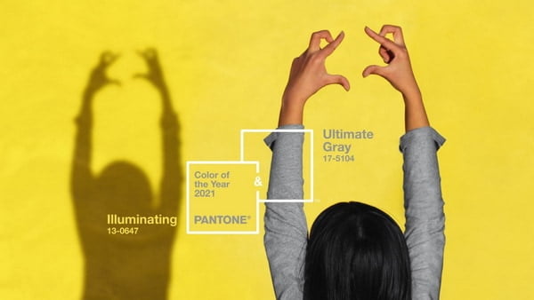
Pantone unveiled the colors for 2022, opting for two shades: PANTONE 17-5104 Ultimate Gray + PANTONE 13-0647 Illuminating, two independent colors that accompany each other to evoke feelings of hope and energy.
Made up of a light gray and a vibrant yellow, the Pantone 2022 colors reflect a history of color that transmits deep sensations associated with light and kindness. It is definitely a contrast to Pantone Fall-Winter 2021-2022.
“The union of an enduring Ultimate Gray with the vibrant yellow that represents the Illuminating expresses a message of positivism combined with strength. This practical and solid color combination, while at the same time warm and upbeat, offers us resilience and hope. We need to feel encouraged and comforted; it is something essential for the human soul ”
-Leatrice Eiseman, Executive Director of the Pantone Color Institute
Bring your color palette to life and download our guide to neon colors
Color trends in graphic design 2022
The color trends in graphic design for 2022 will be directed, to a great extent, to the use of soft, calming and relaxing colors. Unlike previous years, the implementation of neon tones and strong colors will take a back seat to give prominence to visual tranquility.
Here are 3 color trends in graphic design that will be indispensable as colors for the 2022 season.
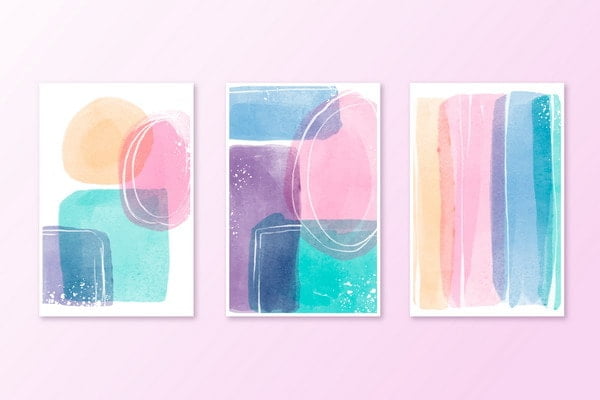
Color Trends in Graphic Design 2022 : Pastel Colors
One of the color trends that we will begin to see in graphic design will be the use of pastel colors in different shades to highlight certain elements in a piece.
After a year so full of ups and downs, users will want navigation experiences that are soothing colors. Therefore, the use of subtle magentas, pinks and oranges will be of great importance for graphic design and will generate a great impact on users.
Color Trends in Graphic Design 2022: Monochrome Colors
We know that in 2022 we want to have online experiences that are pleasing to our eyes. And although monochromatic colors have been applied for quite some time in different aspects, it will continue to be one of the color trends in graphic design for the coming year.
A monochrome color palette consists of a set of hues derived from a single color. However, it is possible to add another flat color that is complementary to highlight certain elements. People will want to see harmonious pieces whose colors complement each other, but which retain a common subtlety through the hues to convey serenity and harmony.
Color trends in graphic design 2022: Flat colors, but nice
2021 has been one of the years in which we have spent the most time in front of a cell phone or a computer. And it is no secret to anyone that 2022 will be another year in which virtuality will be part of our routine.
Therefore, one of the color trends in graphic design for 2022 is the use of flat colors created to guarantee the comfort of our eyes, through simple, subtle, fresh and natural designs that facilitate online navigation for a long time.
To learn more about the colors of the 2022 season, we invite you to read our post on the graphic design trends in 2022 that will cause a stir.
Color trends in interior design 2022
As 2021 draws to a close, many companies focused on painting and decoration have launched their color trends for 2022 based on creating spaces where people can feel calm and optimistic.
From warm colors to bright hues to pastel hues, the color palettes for interior design in 2022 will seek to convey feelings of joy and comfort.
Interior Design Color Trends 2022: Ultimate Gray / Illuminating (Pantone)
As presented above, Pantone’s choice of colors for 2022 is a combination of colors that convey a message of strength and hope, which, applied to interior design, perfectly encapsulates that feeling of comfort.
Interior Design Color Trends 2022: Brave Ground (Dulux)
Dulux, one of the most important architectural paint brands in the world, has chosen Brave Ground as one of the colors that will be trending in 2022. It is a set of color palettes that are intended to emotionally comfort those who decide to apply them to your space. Some of these palettes are:
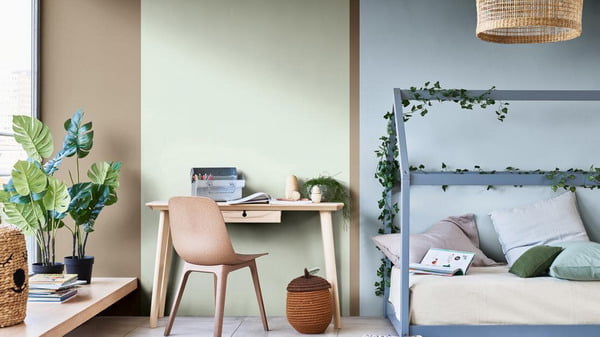
Earth color palette: These colors applied to interior design will refer to the natural tones of the earth, sky and sea, which will give a feeling of confidence and tranquility. This combination is ideal for anyone who wants to connect with the outside world and spice up their home.
Expressive color palette: A color palette consisting of different combinations of red and pink hues, but with moderate saturation. These nuances will add sensations linked to joy and creativity, perfect for applying them in bedrooms, offices or creative spaces.
Timeless color palette : This color palette is inspired by shades of orange, yellow, or ocher used for a long time. However, they are classified as energizing tones without being overwhelming, bringing balance and positivity to any space.
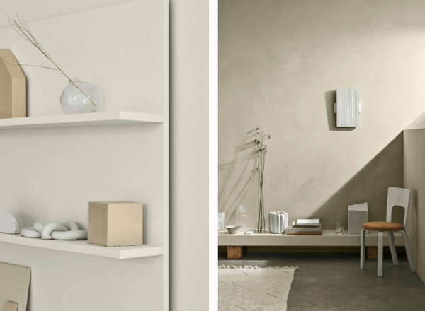
Color trends in interior design 2022: Jotun Lady
Very similar to what was proposed by Brave Ground, the Norwegian company Jotun Lady put its cards on the table and launched a collection of colors for 2022 entitled ” Rediscover “, which consists of 4 color palettes that will revolutionize the way of combining spaces.
Neutral and soft color palette: Although they don’t generate a visual impact at first glance, this color palette is characterized by subtlety. The spaces with a minimalist style should not why look empty. This selection achieves the perfect balance between subtlety and beauty.
Pastel color palette: Derived from yellow and brown, this color palette will generate a nostalgic style but at the same time fun, ideal for combining them in large places and placing objects that highlight their tones.
Airy blue color palette : Derived from blue, these colors are indicated to create a harmonious and extremely welcoming environment.
Inspired by the contrasts of nature, this color palette brings the notion of fresh air to any type of space.
Author and editor. I write about Interior designs, Beauty tips, IT services for business, Real estate and foreign trade. Strongly passionate about games, comics, art, literature, design, fashion and decoration, I will tell you in detail the best stories in the world of beauty and will guide you through the most popular trends of the moment.