In interior design, as in runway fashion, color trends change from time to time. And every season brings certain changes in the interior palette. In this review, we will talk about the most popular interior colors 2025, current combinations and the rules for selecting color schemes.
Interior colors 2025: TOP-6 trends
In the list of favorites in 2025, there are several colors that designers consider the most relevant and promising.
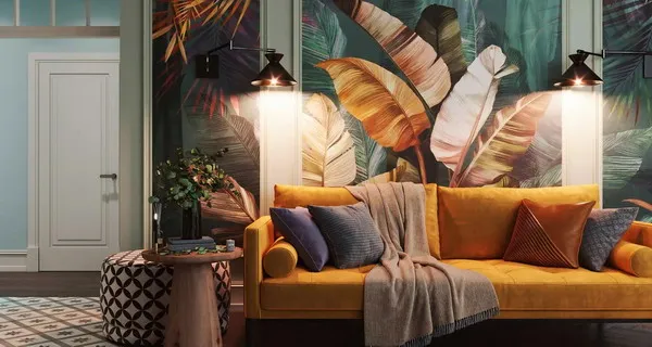
- Juicy greens
Design gurus suggest using green accents to the maximum: for wall decoration (wallpaper, paint, frescoes) and furniture facades. But if you are not ready for total greenery, choose a neutral beige background and green accessories in an equal combination with companions such as orange, turquoise and purple.
- Temperamental Viva Magenta
We can say that this rich color is quite in the spirit of modern interior eco-trends. It can be combined with light wood, gray, beige and purple shades. And the choice of palette depends on the style of the project and the overall design concept.
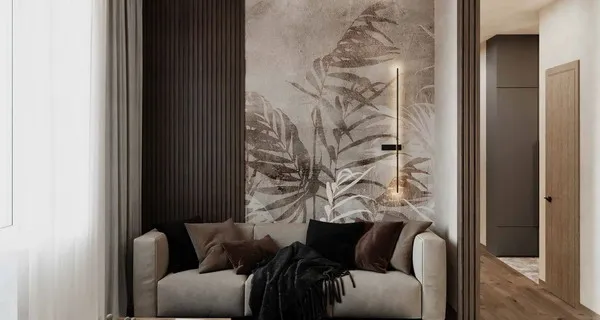
- Dusty rose
Dawn shades of dawn in combination with white and pink marble are ideally accented with gilding and blend well with the soft beige background of the interior.
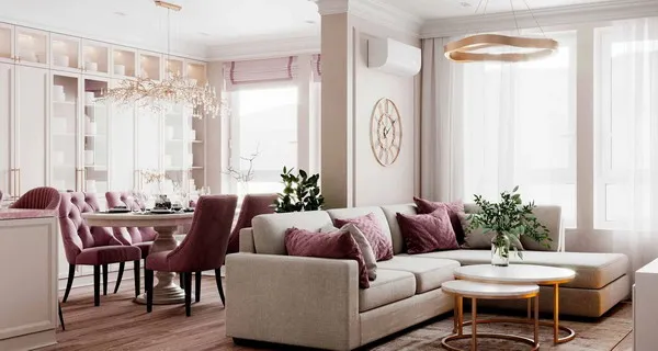
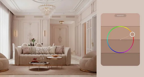
- Warm beige
Beige shades are successfully combined with deep chocolate and blue, are favorable to any metals, and can be used in complex color schemes.
- Luxurious gold
Golden accents fit perfectly on the monochrome beige-brown base of the interior and are set off by deep black.
The classic antique combination of gold and white does not lose popularity. Such a duet sounds especially relevant in bathroom interiors, where brass accessories are ideally combined with white sanitary ware, furniture and marble.
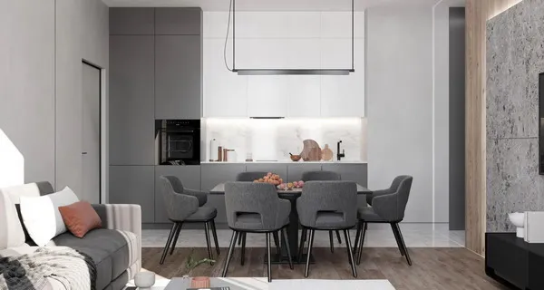
- Laconic gray
Gray is self-sufficient and multifaceted, which allows using only shades of gray (monochrome) to create laconic interiors. But it can also be a great companion for black, white, brown, beige, blue, yellow, orange and green.
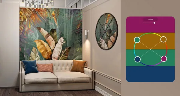
Interior color trends 2025: Top 6 color schemes
Designers use the color wheel to draw up the color palette of the interior. The selection principle is simple – bright color accents should balance each other, that is, when optically mixed, give a neutral achromatic tone (white or gray).
In the interior, this is especially important not only in terms of the aesthetics of the color environment, but also from the point of view of psychology. For example, the stimulating effect of red can be neutralized with soothing blues and greens, and bright yellows can be balanced with blues and turquoise.
- Monochrome (Monochromatic)
Monochrome is usually used to build a neutral background base for the interior, which is subsequently complemented by accent colors. But a purely monochrome interior, without any accents, is also in fashion.
Examples of popular monochrome scales in the interior:
- beige-brown;
- shades of gray;
- black and white.
- Complementary
Examples of complementary interior colors:
- blue and terracotta;
- blue and mustard;
- turquoise and crimson;
- purple and green.
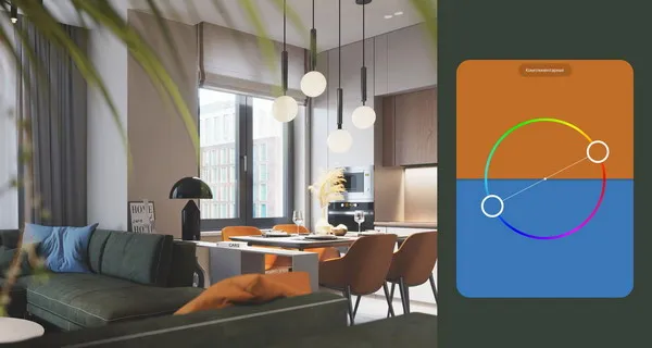
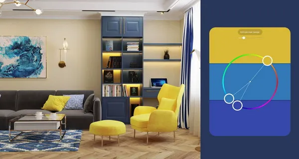
- Contrasting triad (Split Complementary)
- Analogous triad (Analogous)
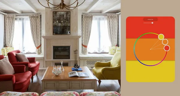
- 1st – main;
- 2nd – supporting;
- 3rd – either a mixture of the first two, or an accent separated from them.
Examples of analog colors in the interior:
- red, yellow and orange;
- mustard, olive and green;
- purple, blue and turquoise.
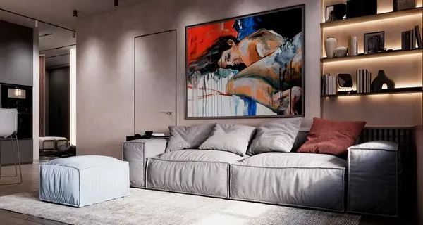
Perhaps this is the only scheme where color accents are not clearly neutralized by opposite tones. But for balance, you can add spot splashes of additional colors, as our designers did in the project in the photo above. Here, bright yellow, orange and red are contrasted with a blue speck of a stand for fireplace accessories on a coffee table.
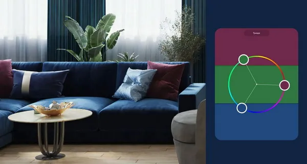
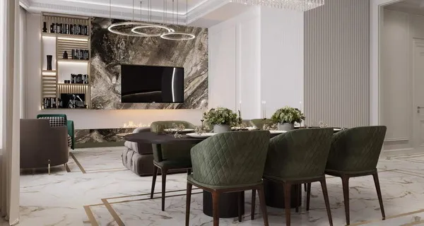
- Triad
Examples of triadic colors in the interior:
- blue, green, burgundy;
- purple, green, terracotta;
- turquoise, coral, lilac;
- pink, blue, green.
- Tetrad
Due to its stability and complexity, the tetrad is mainly used by professionals. We can see it on designer wallpapers, interior paintings and art posters. It is difficult to add something to such a color scheme, therefore, in textile design, one should adhere to the existing tones of the range, remaining within its limits.
Examples of notebook colors in the interior :
- fuchsia, terracotta, blue and green;
- blue, gold, fuchsia, green;
- mint, chocolate, kiwi and lilac.
Interior paint colors 2025: Shades and combination
Gray and beige
Natural gamma
Design work on a complex and unbanal concept will fully pay off, because the resulting composition will, like a painting, immerse you in the atmosphere of a natural landscape.
Coffee with milk
A pleasant range of shades of cappuccino and latte, espresso and dark chocolate gives relaxing comfort and at the same time has a slight invigorating effect.
Juicy accents on a neutral background
5 rules for choosing interior colors 2025
When choosing a combination of colors for a residential interior in 2025, the following rules must be observed:
- Maintain proportion
- base (dominant) color – 60%;
- accompanying (additional) tones – 30%;
- accent shade – 10%.
- Maintain associations
To create the desired mood in the interior, use color combinations or single accents that are associated with certain emotions, such as a vacation on a tropical island or a recent holiday.
- Consider the visual effect
Choosing the main color in the interior of the kitchen, living room or bedroom, you need to consider how it works in space. Light colors expand, but the contrasting color ensemble, although it looks dynamic, visually narrows the space.
- Combine space with color
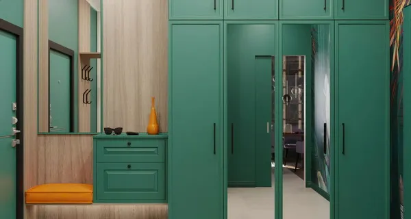
The selected combination of colors is recommended to be repeated in several rooms of an apartment or house. As a result, there will be a feeling of visual color migration, which will visually unify the space. At the same time, the “repetition” should be unobtrusive, for example, the theme of tropical shades in the bathroom can be repeated in the design of the hallway.
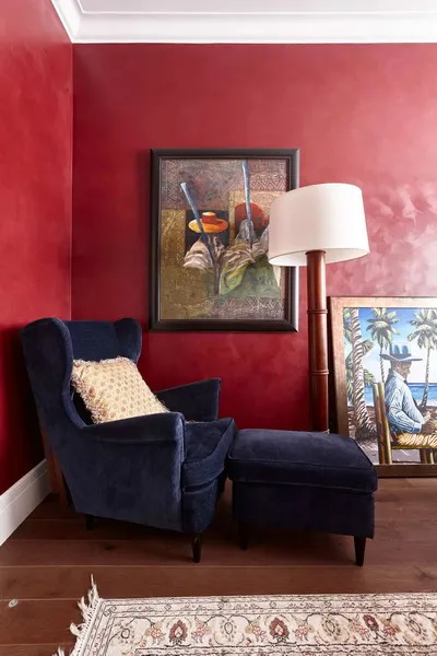
- Create a winning contrast
The easiest way to create contrast in the interior is to use black. Against its background, the rest of the shades look cleaner and more effective. Are you afraid of black? Then do not get carried away with black details – one item is enough.


